Instead of pre-defined colors in Approved Color picker, then customer has a requirement being able to create user-defined colors/themes, but instead of just a color picker, we would like to have this as a collection of themes as we can add additional properties later besides the color.
I was looking a Contentment template list something like the following:
However not sure if it possible using Data List with nodes as data source as this doesn’t contain the actual color (perhaps in a custom data source returning JSON).
In terms of doing something similar, maybe-ish… but it was making use of the Contentment’s List Item property-editor with the “Umbraco Content Property Values” data-source… so I’d have control over each item’s name/value/icon/description.
Yeah, I just noticed it used Liquid syntax. However in this case value is just UDI-reference.
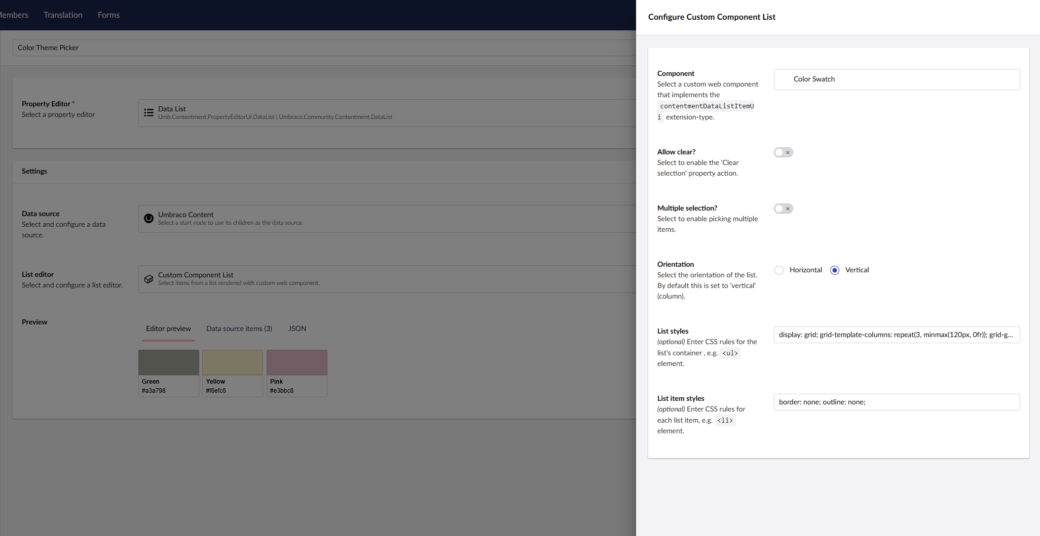
I noticed the newer Custom Component List, which may be better for what I am trying to solve, but I am not sure if we can fully control the selected/outline style.
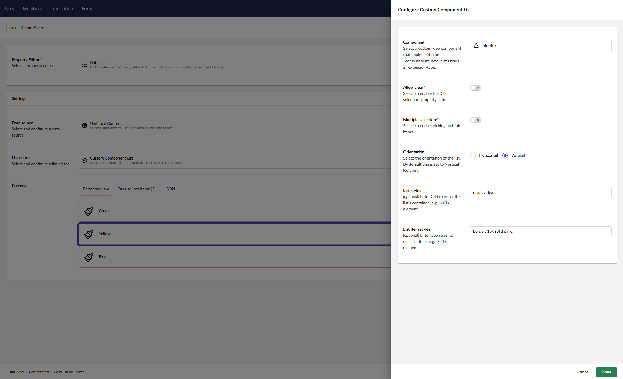
I just tried a quick test using the built-in Info Box
Yes, that’s the stored value format of the “Umbraco Content” data-source. For more granular/targeted values, you may need to roll your own custom data-source. (I’d try to make the data-sources generic as possible). Or try the “Umbraco Content Property Values” data-source using the “List Items” property-editor?
The Custom Component List editor is still fairly new, so needs some more real-world road testing (as you are doing ) to iron out any functional and cosmetic issues. (I’m open to any feedback/suggestions/updates).
As a general comment, Contentment Data List can get you over 90% of the way, but if you really need to tailor your UI/UX, then rolling your own property-editor UI is probably the way to go.
I had a look at the “Custom Component List”.
As mentioned here a NPM package would be great, but I have picked the types needed.
Another suggestion.
Using Custom Component List, perhaps it should disable the selected style (or an option to disabled this).
Then perhaps ContentmentDataListItemUiElement can export selected state as we can then implement this in the custom UI depending on which component is used.
An example although not completed yet:
import type { ContentmentDataListItemUiElement, ContentmentListItem } from '../types.js';
import { customElement, html, nothing, property } from '@umbraco-cms/backoffice/external/lit';
import { UmbLitElement } from '@umbraco-cms/backoffice/lit-element';
import { UmbDocumentDetailRepository } from '@umbraco-cms/backoffice/document';

@customElement('contentment-data-list-item-ui-color-swatch')
export class ContentmentDataListItemUiColorSwatchElement extends UmbLitElement implements ContentmentDataListItemUiElement {
	@property({ attribute: false })
	item?: ContentmentListItem;

       //@state selected = false;

	#documentRepository = new UmbDocumentDetailRepository(this);

	constructor() {
    	super();
		this.#getDocumentData();
	}

	async #getDocumentData() {
		if (!this.item?.value)
			return;

		const { data } = await this.#documentRepository.requestByUnique(this.item.value);
		// I get some data!
		console.log(data);
	}

	override render() {
		if (!this.item) return nothing;
		return html`
			<uui-color-swatch color="" selected></uui-color-swatch>
		`;
	}
}

export { ContentmentDataListItemUiColorSwatchElement as element };

declare global {
	interface HTMLElementTagNameMap {
		'contentment-data-list-item-ui-color-swatch': ContentmentDataListItemUiColorSwatchElement;
	}
}
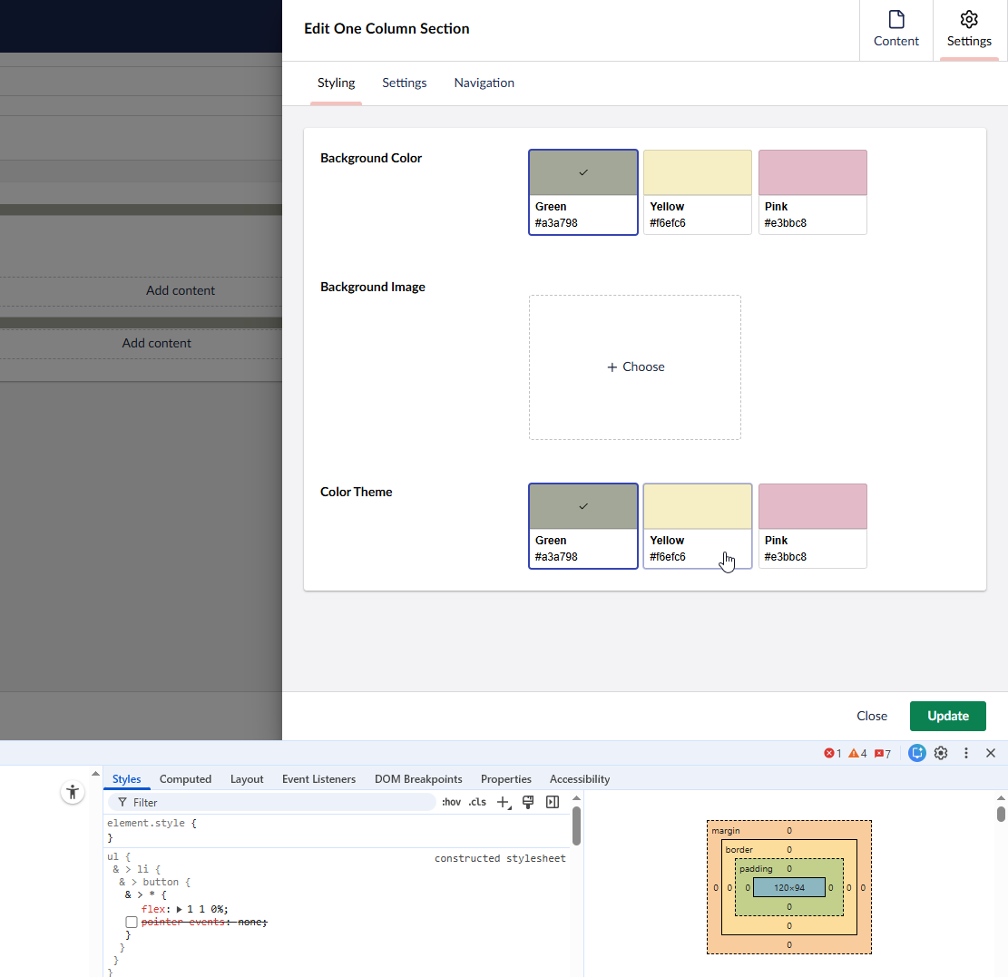
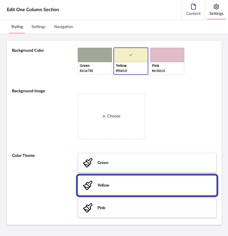
I was able to make something close to Approved Color picker, but using Umbraco Content nodes as data source + Custom Component List in Contentment.
Main difference is that Contentment disable pointer events, so hover and focus style on <uui-color-swatch> doesn’t work, but if disabled it cause double focus on wrapping <button> + <uui-color-swatch>.
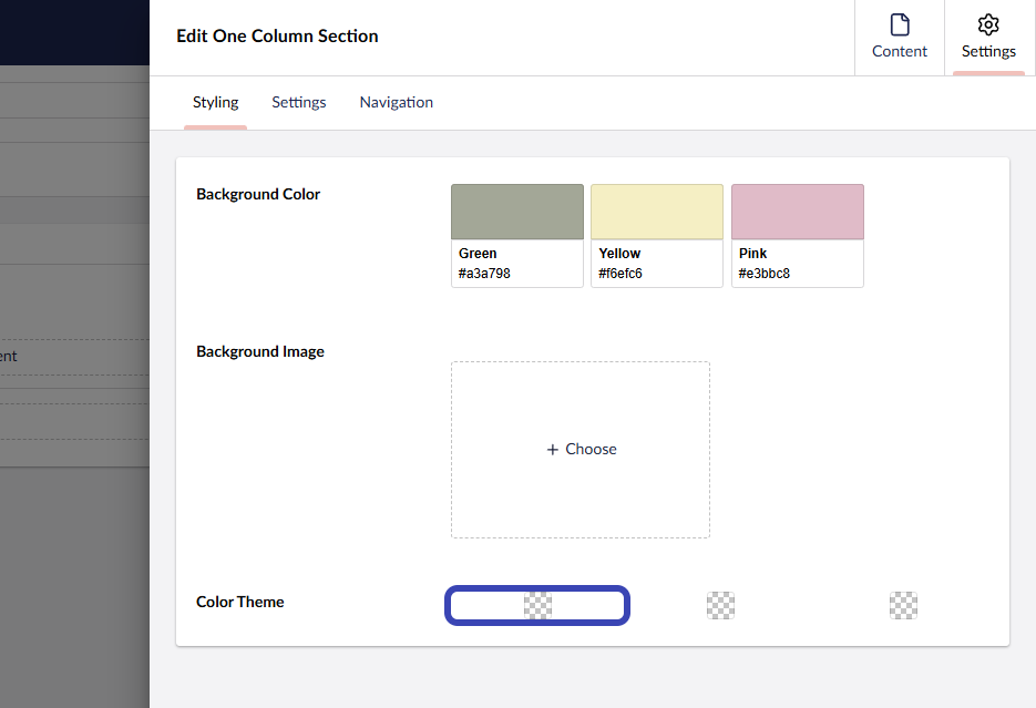
At top Approved Color Picker and at bottom Contentment property editor:
 ) to iron out any functional and cosmetic issues. (I’m open to any feedback/suggestions/updates).