UI Advice: Displaying a content locked label on content

After the discussion over in custom modals/dialog and with Niels suggestion to perhaps use some other form of UI/UX to solve the problem than a dialog/modal.

Current approach

Concerns

  • I don’t like how the label/box overlays the name of the node

Asking for help

  • How would you solve this with UI ?
  • Can you help give me some lovely CSS or suggestions on how to improve this :slight_smile:

I can insert a DOM element before the workspace which currently is this.

import { css, customElement, html } from '@umbraco-cms/backoffice/external/lit';
import { UmbLitElement } from '@umbraco-cms/backoffice/lit-element';

@customElement('contentlock-lock-status')
export class ContentLockLockStatusElement extends UmbLitElement {
    
    constructor() {
        super();

        // TODO: Consume our context
        // TODO: Or expose simpler properties for when we create/insert the DOM element
    }

    render() {
        return html `
            
            <div id="overlay"></div>
            <div id="lockedState">The page is locked by Warren</div>
        `;
    }

    static styles = css`
        :host {
            position: absolute;
            background:rgba(255, 0, 0, 0.05);
            inset:0;
            z-index:9999;
            border:2px solid var(--uui-color-danger);
            pointer-events:none; // Allow us to click through the overlayed div to items underneath
        }

        #overlay {
            
        }
    
        #lockedState {
            background: var(--uui-color-danger);
            color: var(--uui-color-danger-contrast);
            padding: 3px 10px;
            display:inline-block;
            border-radius:0 0 5px 0;
        }
    `;
}

export default ContentLockLockStatusElement;

declare global {
    interface HTMLElementTagNameMap {
        'contentlock-lock-status': ContentLockLockStatusElement;
    }
}

CSS

:host {
    position: absolute;
    background:rgba(255, 0, 0, 0.05);
    inset:0;
    z-index:9999;
    border:2px solid var(--uui-color-danger);
    pointer-events:none; // Allow us to click through the overlayed div to items underneath
}

#overlay {
    
}

#lockedState {
    background: var(--uui-color-danger);
    color: var(--uui-color-danger-contrast);
    padding: 3px 10px;
    display:inline-block;
    border-radius:0 0 5px 0;
}

Are you able to insert a little alert banner like Umbraco Workflow does when a page is locked in an active workflow state?

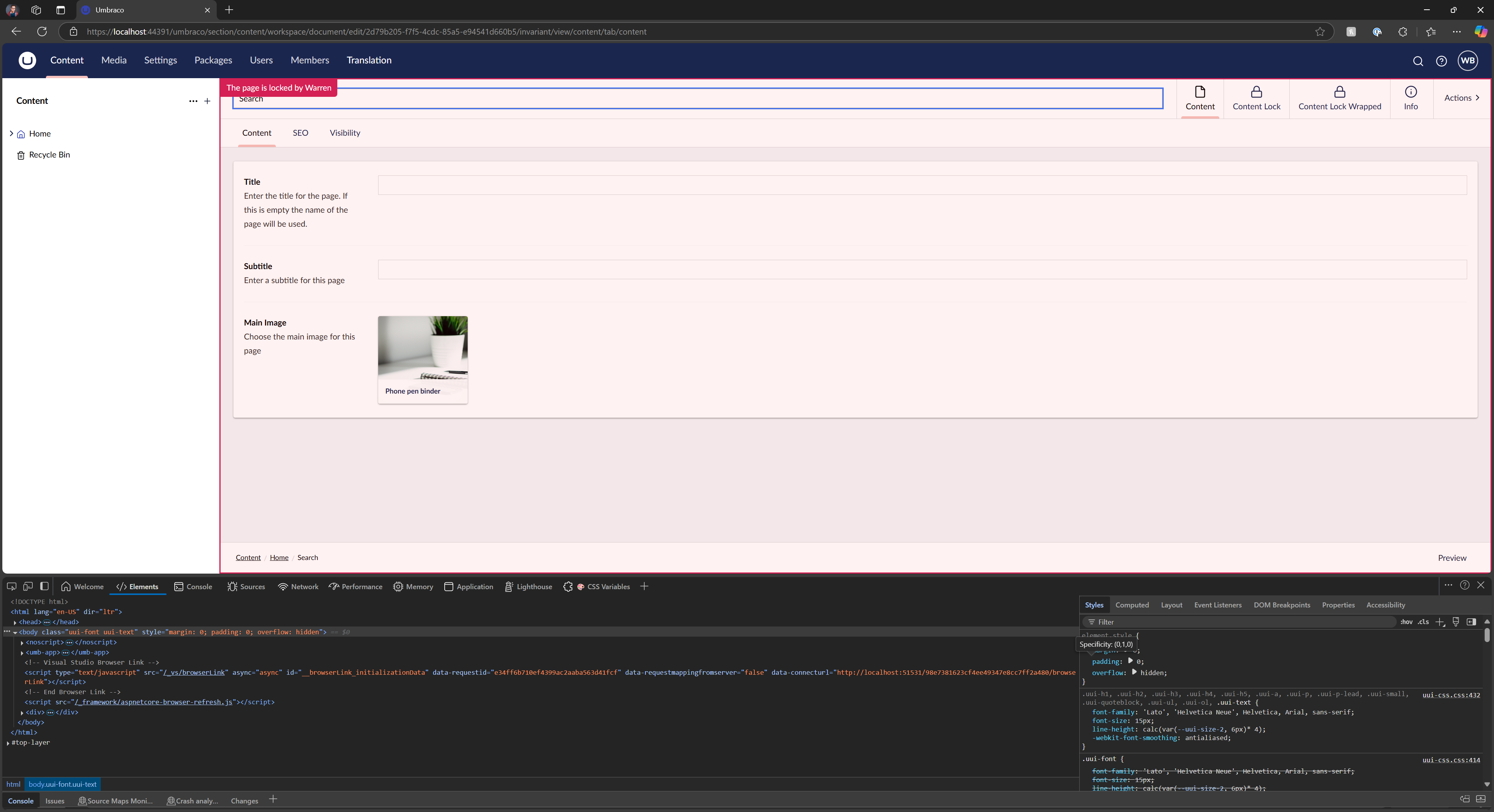
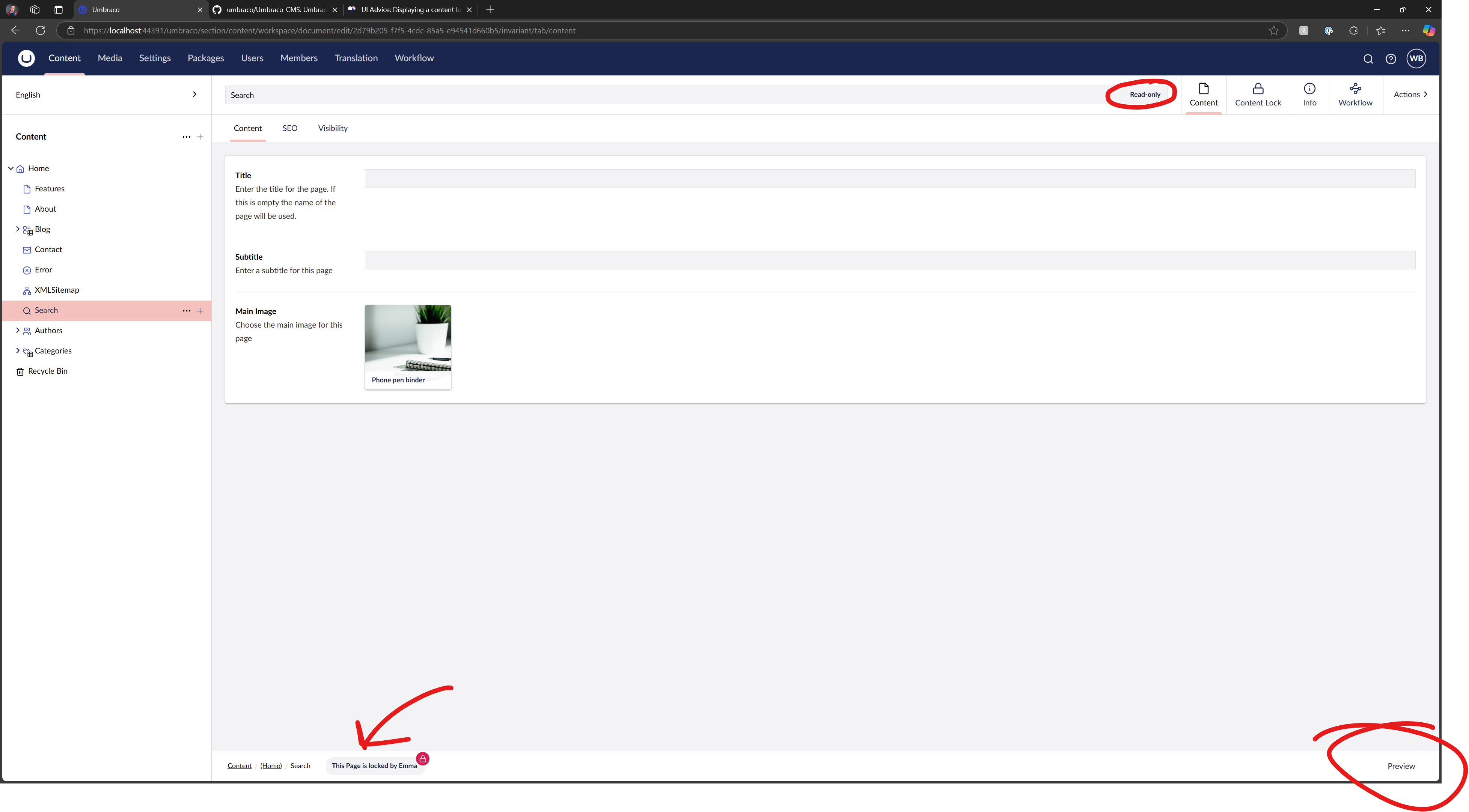
Having the dimmed overlay ‘shielding’ the content a little more visibly than the way Workflow slightly greys out the field is a good touch. But there is a nicety in leaving the content tabs available to interact with. It would allow users to navigate through all the other content sections if they were trying to reference a locked one for authoring of a different page for example.

Yep I have had that thought as well, I just don’t know how to do it.

Does Workflow for V15 do this currently, if so I may need to look into it to see if I can figure out hows its achieved.

Seems like this is not a thing in V15 of Workflow, unless I am looking in the wrong places ?!

It seems to set the entire node as readonly, which is something I like and will investigate to see how to do.

But it seems there is no longer the pink message/bar across the top of content and only the action is set to Workflow detail.

1 Like

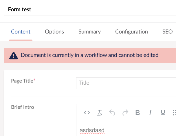
Aw dang! I’ve only played around with up to v13 so didn’t know it was just gone in v15. That’s unfortunate. It was such a nice’n noticeable thing for authors who aren’t the most tech savvy and aren’t really attentive to tiny notes or icon-only indicators. With just the save/publish options replaced I can already hear a buncha clients asking why they can’t edit xD

In v13 it just appears on the Content App view when looking at a page and you don’t need to explore anywhere else to see that little alert. So it’s nice and upfront without being too disruptive.

Short of being able to plop something into the document workflow… The top would be the nicest and first-seen locations for a content lock indicator. However, being that it can be so different depending on the available options and setup, perhaps placing an indicator around where the save/publish button would be is the next best? It’s a more stable area in terms of the space around it without risk of covering something of interest, and is a place authors are used to looking at for actions.

Thanks for your input.
Yeh my current thing is that I am using a Workspace Footer App

This is my current UX as of now

  • Sets the node as Read Only - Umbraco Feature
  • Removes action/buttons such as Publish etc that they can’t do
  • Adds Footer Workspace App

TODOs

  • Remove the context app top right (next to content, info etc)
  • Add new lock/unlock entity actions for Actions top right or right click of content node
1 Like