Property Editor: How do I use valdiation?

Hi there :waving_hand:
Feeling a bit overwhelmed and struggling to find the approach on how to use and set custom validation messages on a property editor.

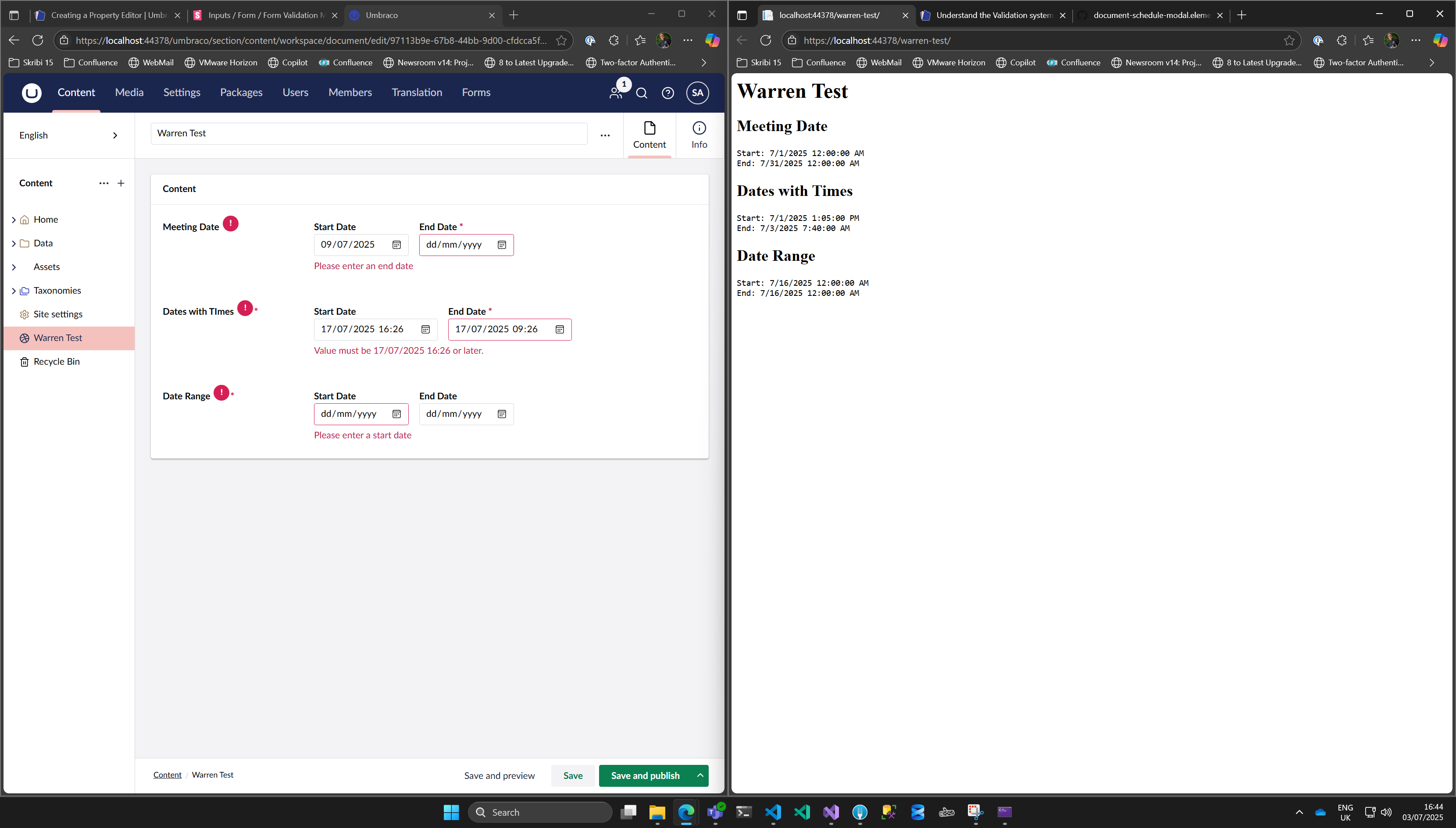
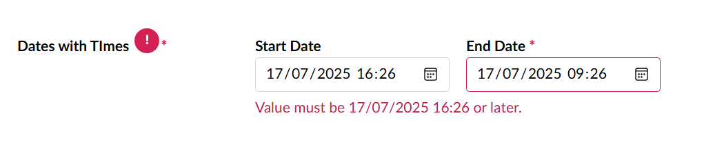
I am building a date range property editor and need to set a couple of custom validation messages:

  • End Date is required
  • Start Date is required
  • End Date can not be before the start date

Screenshot

The image shows a website interface with fields for start and end dates for meeting dates and dates with times, along with value settings in JSON format. (Captioned by AI)

Current Code

import { UmbInputDateElement } from '@umbraco-cms/backoffice/components';
import { UmbChangeEvent } from '@umbraco-cms/backoffice/event';
import { css, customElement, html, nothing, property, state } from '@umbraco-cms/backoffice/external/lit';
import { UmbLitElement } from '@umbraco-cms/backoffice/lit-element';
import type { UmbPropertyEditorConfigCollection, UmbPropertyEditorUiElement } from '@umbraco-cms/backoffice/property-editor';
import { UmbTextStyles } from '@umbraco-cms/backoffice/style';

interface DateRangeValue {
    StartDate: string | null;
    EndDate: string | null;
}

@customElement('date-range-picker')
export default class DateRangePickerElement extends UmbLitElement implements UmbPropertyEditorUiElement {
	
    @property({ type: Boolean, reflect: true })
	readonly = false;

    @property({ type: Boolean, reflect: true })
    mandatory?: boolean;

    @property()
    mandatoryMessage?: string;
    
    /*
    {
        "StartDate": "2021-04-15 00:00:00", // Can I parse this to be a Date object in JS (Technically missing the T part)
        "EndDate": null
    }
    */
    @property({ type: Object })
    value: Partial<DateRangeValue> = {};

    /*
    [
        {
            "alias": "endDateIsRequired",
            "value": true
        },
        {
            "alias": "enableTimePicker",
            "value": false
        }
    ]
    */
    set config(value: UmbPropertyEditorConfigCollection | undefined) {
        this._endDateIsRequired = value?.getValueByAlias('endDateIsRequired') ?? false;
        this._enableTimePicker = value?.getValueByAlias('enableTimePicker') ?? false;
    }

    // Add validation method
    #validateDateRange(): void {
        const startDate = this.value?.StartDate ? new Date(this.value.StartDate) : null;
        const endDate = this.value?.EndDate ? new Date(this.value.EndDate) : null;
        
        // Check if end date comes before start date
        this._isDateRangeInvalid = !!(startDate && endDate && endDate < startDate);

        // TODO: How do I use some native validation ?!
    }

    @state()
    private _isDateRangeInvalid: boolean = false;

    @state()
    private _endDateIsRequired: boolean = false;

    @state()
    private _enableTimePicker: boolean = false;


	#onInputStart(e: InputEvent) {
        // 2025-06-03
        // 2025-06-08T19:00
        const startDateValue = (e.target as UmbInputDateElement).value.toString();
        console.log('Start Date Value:', startDateValue);

        const parsedDate = startDateValue ? new Date(startDateValue) : null;
        console.log('Parsed Start Date:', parsedDate);

        // Set date as this format '2025-06-08T19:00'
        const formattedDate = this.formatDateForInput(parsedDate);

        this.value = {
            ...this.value,
            StartDate: formattedDate
        };

        this.dispatchEvent(new UmbChangeEvent());
        this.#validateDateRange();
    }

    #onInputEnd(e: InputEvent) {
        // 2025-06-03
        // 2025-06-08T19:00
        const endDateValue = (e.target as UmbInputDateElement).value.toString();
        console.log('END Date Value:', endDateValue);

        const parsedDate = endDateValue ? new Date(endDateValue) : null;
        console.log('Parsed END Date:', parsedDate);

        // Set date as this format '2025-06-08T19:00'
        const formattedDate = this.formatDateForInput(parsedDate);

        this.value = {
            ...this.value,
            EndDate: formattedDate
        };
        this.dispatchEvent(new UmbChangeEvent());
        this.#validateDateRange();
    }

    private formatDateForInput(date: Date | null): string {
        if (!date) return '';
        
        // Get local date/time components
        const year = date.getFullYear();
        const month = String(date.getMonth() + 1).padStart(2, '0');
        const day = String(date.getDate()).padStart(2, '0');
        const hours = String(date.getHours()).padStart(2, '0');
        const minutes = String(date.getMinutes()).padStart(2, '0');
        
        if(!this._enableTimePicker) {
            return `${year}-${month}-${day}`; // Format as 'YYYY-MM-DD' for date input
        }

        // Format as 'YYYY-MM-DDTHH:MM' for datetime-local input
        return `${year}-${month}-${day}T${hours}:${minutes}`;
    }

    constructor() {
        super();
        // If we need to observe or consume contexts
    }

	override render() {
		return html`
            <div class="date-inputs">
                <div class="date-field">
                    <uui-label>Start Date</uui-label>
                    <umb-input-date 
                        @input=${this.#onInputStart}
                        .value=${this.value?.StartDate ?? ''}
                        .type=${this._enableTimePicker ? 'datetime-local' : 'date'}></umb-input-date>
                </div>
                <div class="date-field">
                    <uui-label>End Date ${this._endDateIsRequired ? html `<span class="required">*</span>`: nothing}</uui-label>
                    <umb-input-date
                        @input=${this.#onInputEnd}
                        .value=${this.value?.EndDate ?? ''}
                        .min=${this.value?.StartDate ?? ''}
                        .type=${this._enableTimePicker ? 'datetime-local' : 'date'}
                        ?required=${this._endDateIsRequired}></umb-input-date>
                </div>
            </div>

            ${this._isDateRangeInvalid ? 
                html`
                    <div class="validation-message">
                        <uui-icon name="icon-alert" style="color: var(--uui-color-danger);"></uui-icon>
                        End date cannot be before start date
                    </div>` 
                : nothing
            }

            <umb-code-block language="value">
                ${JSON.stringify(this.value, null, 2)}
            </umb-code-block>

            <pre>
                End date is required: ${this._endDateIsRequired}
                Enable Time Picker: ${this._enableTimePicker}

                Value.StartDate: ${this.value?.StartDate}
                Value.EndDate: ${this.value?.EndDate}

                Readonly: ${this.readonly}
                Mandatory: ${this.mandatory}
                Mandatory Message: ${this.mandatoryMessage}
            </pre>
        `;
	}

	static override readonly styles = [
		UmbTextStyles,
		css`
			uui-input {
				width: 100%;
			}

            .date-inputs {
                display: flex;
                gap: 1rem;
                align-items: flex-start
            }

            uui-label {
                display:block;
            }

            .required {
                color: var(--uui-color-danger);
                font-weight: 900;
            }
		`,
	];
}

declare global {
	interface HTMLElementTagNameMap {
		'date-range-picker': DateRangePickerElement;
	}
}

Existing Docs

The existing documentation for validation is quite detailed and I am not sure I understand how to use it and nor does it talk about setting any custom validation messages. What am I missing?

In addition to this the tutorial for creating a property editor, seems to encourage server side validation approach and does not cover the scenario of using client side validation

Perhaps one for the docs team to add/improve on?

Any pointers or advice

So do you have any pointers or advice on what I need to be doing to set custom validation messages for this property editor?

:umbraco-heart:

Hi Warren,

This might help a lot! I managed to get ‘custom’ validation working and in my case even conditionally:

1 Like

Thanks Luuk
Do you mind sharing your code, would be interesting to see please :slight_smile:

Let’s see. My editor is a videoplayer where you can just enter the URL of a video in multiple formats of certain video platforms and you’ll get to see the preview of the video in the backoffice.

When a plaform supports oEmbed (Youtube, Vimeo), I can just get the title of the video from that and you optionally override it. However, if I can’t get the title, the title field is no longer an override, but required.

// You need the UmbFormControlMixin to make it a form with validation
export default class ProudNerdsVideoPropertyEditorUIElement extends UmbFormControlMixin<VideoPlayerPropertyEditorModel | undefined, typeof UmbLitElement>(UmbLitElement, undefined) implements UmbPropertyEditorUiElement {

//When a video URL is entered and the details of the video are loaded, check if the field is required  
async #setVideoDetails(videoParameters: VideoPlayerPropertyEditorModel): Promise<boolean> {
  //Some API call to get video details here
  ...

  // Wait for videoDetails to cause a re-render
  await this.updateComplete;
  
  // Now DOM will include #videoTitleInput
  this.#setRequiredFields();
  }

//Make the title field required or not
   async #setRequiredFields(forceRemove: boolean = false) {
		const videoInput = this.shadowRoot?.querySelector('#videoTitleInput') as UUIInputElement | null;

		if (videoInput === null)
			return;

		if (videoInput && this.#titleIsRequired() && !forceRemove) {
			this.addFormControlElement(videoInput);
		} else if (videoInput) {
			this.removeFormControlElement(videoInput);
		}
	}
}

This prevents the page to be published if the validation fails. Just use the required property on whatever you want to validate.

Thanks @LuukPeters that has helped seeing how you done it along with Niels post on that other thread.

Summary

So to summarize for anyone reading along:

  • Extend from UmbFormControlMixin<T> where T is the shape of the data being saved/stored for the property editor
extends UmbFormControlMixin<Partial<DateRangeValue>>(UmbLitElement)
  • Add the Form control from UUI or Umb components with addFormControlElement
override firstUpdated() {
    this.addFormControlElement(this.shadowRoot!.querySelector('#startDate')!);
    this.addFormControlElement(this.shadowRoot!.querySelector('#endDate')!);
}
  • The UUI-input or UMB-input web components own validation from these controls will make it visible and prevent saving etc on the node

Validation in action

Full code of date range property editor

import { UmbInputDateElement } from '@umbraco-cms/backoffice/components';
import { UmbChangeEvent } from '@umbraco-cms/backoffice/event';
import { css, customElement, html, nothing, property, state } from '@umbraco-cms/backoffice/external/lit';
import { UmbLitElement } from '@umbraco-cms/backoffice/lit-element';
import type { UmbPropertyEditorConfigCollection, UmbPropertyEditorUiElement } from '@umbraco-cms/backoffice/property-editor';
import { UmbTextStyles } from '@umbraco-cms/backoffice/style';
import { UmbFormControlMixin } from '@umbraco-cms/backoffice/validation';

interface DateRangeValue {
    StartDate: string | null | undefined;
    EndDate: string | null | undefined;
}

@customElement('date-range-picker')
export default class DateRangePickerElement 
    extends UmbFormControlMixin<Partial<DateRangeValue>>(UmbLitElement)
    implements UmbPropertyEditorUiElement {
	
    @property({ type: Boolean, reflect: true })
	readonly = false;

    @property({ type: Boolean, reflect: true })
    mandatory?: boolean;

    @property()
    mandatoryMessage?: string;
    
    // Stored JSON value example
    /*
    {
        "StartDate": "2021-04-15 00:00:00"
        "EndDate": null
    }
    */

    /*
    [
        {
            "alias": "endDateIsRequired",
            "value": true
        },
        {
            "alias": "enableTimePicker",
            "value": false
        }
    ]
    */
    set config(value: UmbPropertyEditorConfigCollection | undefined) {
        this._endDateIsRequired = value?.getValueByAlias('endDateIsRequired') ?? false;
        this._enableTimePicker = value?.getValueByAlias('enableTimePicker') ?? false;
    }

    @state()
    private _endDateIsRequired: boolean = false;

    @state()
    private _enableTimePicker: boolean = false;

    // Just a simple bool flag to help debugging
     #debug: boolean = false;

	#onInputStart(e: InputEvent) {
        // 2025-06-03
        // 2025-06-08T19:00
        const startDateValue = (e.target as UmbInputDateElement).value.toString();
        console.log('Start Date Value:', startDateValue);

        const parsedDate = startDateValue ? new Date(startDateValue) : null;
        console.log('Parsed Start Date:', parsedDate);

        // Set date as this format '2025-06-08T19:00' or '2025-06-08' if time picker is disabled
        const formattedDate = this.#formatDateForInput(parsedDate);

        this.value = {
            ...this.value,
            StartDate: formattedDate
        };

        this.dispatchEvent(new UmbChangeEvent());
    }

    #onInputEnd(e: InputEvent) {
        // 2025-06-03
        // 2025-06-08T19:00
        const endDateValue = (e.target as UmbInputDateElement).value.toString();
        //console.log('END Date Value:', endDateValue);

        const parsedDate = endDateValue ? new Date(endDateValue) : null;
        //console.log('Parsed END Date:', parsedDate);

        // Set date as this format '2025-06-08T19:00' or '2025-06-08' if time picker is disabled
        const formattedDate = this.#formatDateForInput(parsedDate);

        this.value = {
            ...this.value,
            EndDate: formattedDate
        };
        this.dispatchEvent(new UmbChangeEvent());
    }

    #formatDateForInput(date: Date | null): string {
        if (!date) return '';
        
        // Get local date/time components
        const year = date.getFullYear();
        const month = String(date.getMonth() + 1).padStart(2, '0');
        const day = String(date.getDate()).padStart(2, '0');
        const hours = String(date.getHours()).padStart(2, '0');
        const minutes = String(date.getMinutes()).padStart(2, '0');
        
        if(!this._enableTimePicker) {
            return `${year}-${month}-${day}`; // Format as 'YYYY-MM-DD' for date input
        }

        // Format as 'YYYY-MM-DDTHH:MM' for datetime-local input
        return `${year}-${month}-${day}T${hours}:${minutes}`;
    }

    #parse(dateToParse:string | null | undefined): string {
        // The property editor may have existing data in format of
        // 2021-05-12T00:00:00 even when no time was set for property editor

        // To make existing stored values display in the start or end date 
        // then they need to have the time removed 

        if (!dateToParse){
            return '';
        }

        const parsedDate = new Date(dateToParse);
        return this.#formatDateForInput(parsedDate);
    }

    constructor() {
        super();
        // If we need to observe or consume contexts
    }

    override firstUpdated() {
		this.addFormControlElement(this.shadowRoot!.querySelector('#startDate')!);
        this.addFormControlElement(this.shadowRoot!.querySelector('#endDate')!);
	}

	override render() {
		return html`
            <div class="date-inputs">
                <div class="date-field">
                    <uui-label>Start Date</uui-label>
                    <umb-input-date id="startDate"
                        @input=${this.#onInputStart}
                        .value=${this.#parse(this.value?.StartDate) ?? ''}
                        .type=${this._enableTimePicker ? 'datetime-local' : 'date'}
                        ?required=${this.mandatory || this._endDateIsRequired}
                        required-message="${this.mandatoryMessage ? this.mandatoryMessage : 'Please enter a start date'}"></umb-input-date>
                </div>
                <div class="date-field">
                    <uui-label>End Date ${this._endDateIsRequired ? html `<span class="required">*</span>`: nothing}</uui-label>
                    <umb-input-date id="endDate"
                        @input=${this.#onInputEnd}
                        .value=${this.#parse(this.value?.EndDate) ?? ''}
                        .min=${this.value?.StartDate ?? ''}
                        .type=${this._enableTimePicker ? 'datetime-local' : 'date'}
                        ?required=${this._endDateIsRequired}
                        required-message="Please enter an end date"></umb-input-date>
                </div>
            </div>

            ${this.#debug ? this.#renderDebug() : nothing }
        `;
	}

    #renderDebug() {
        return html`
            <umb-code-block language="Stored Value">${JSON.stringify(this.value, null, 2)}</umb-code-block>

            <h4>Config</h4>
            <ul>
                <li>Readonly: ${this.readonly} ${this.readonly ? '✅' : '❌'}</li>
                <li>Mandatory: ${this.mandatory} ${this.mandatory ? '✅' : '❌'}</li>
                <li>Mandatory Message: ${this.mandatoryMessage}</li>
                <li>End date is required: ${this._endDateIsRequired} ${this._endDateIsRequired ? '✅' : '❌'}</li>
                <li>Enable Time Picker: ${this._enableTimePicker} ${this._enableTimePicker ? '✅' : '❌'}</li>
            </ul>
        `;
    }


	static readonly styles = [
		UmbTextStyles,
		css`
			uui-input {
				width: 100%;
			}

            .date-inputs {
                display: flex;
                gap: 1rem;
                align-items: flex-start
            }

            uui-label {
                display:block;
            }

            .required {
                color: var(--uui-color-danger);
                font-weight: 900;
            }
		`,
	];
}

declare global {
	interface HTMLElementTagNameMap {
		'date-range-picker': DateRangePickerElement;
	}
}

Further questions

  • How do I control where the message is displayed in the UI?
    • Currently this seems to show at the end/after the HTML of the property editor
    • In your example Luuk it shows at the bottom, surely it would be nice to put the message nearer to the red input box?
  • If I had another property editor like the suggestions from the tutorial, how would I write custom validation message that would prevent you from writing the words Sitecore or Wordpress
1 Like

@warren this might interest you:

<div class="hours-row" id="hours-${dayIndex}-${hoursIndex}">
  <div class="time-range">
    <uui-input
        type="time"
        .value=${this._formatTime(hours.opensAt)}
        @change=${(e: Event) => {
          const value = this._parseTimeInput((e.target as HTMLInputElement).value);
          this._updateTime(dayIndex, hoursIndex, 'opensAt', value);
        }}
        placeholder="Open time"
        label="Open time"
        ?required=${!this._config.excludeTimes && !this._config.hoursOptional}
        ${umbBindToValidation(this, `opensAt_${dayIndex}_${hoursIndex}`)}
      >
      </uui-input>
     <span>to</span>
     <uui-input
       type="time"
        .value=${this._formatTime(hours.closesAt)}
        @change=${(e: Event) => {
        const value = this._parseTimeInput((e.target as HTMLInputElement).value);
          this._updateTime(dayIndex, hoursIndex, 'closesAt', value);
        }}
        placeholder="Close time"
        label="Close time"
        ?error=${this._hasValidationError(dayIndex, hoursIndex, 'closesAt')}
        .errorMessage=${this._validateTimeField(dayIndex, hoursIndex, 'closesAt')}
        ?required=${!this._config.excludeTimes && !this._config.hoursOptional && !this._config.closedHoursOptional}
        ${umbBindToValidation(this, `closesAt_${dayIndex}_${hoursIndex}`)}>
      >
       </uui-input>
   </div>
</div>

<uui-form-validation-message for="hours-${dayIndex}-${hoursIndex}">
</uui-form-validation-message>

Essentially, you can use uui-form-validation-message with for to target the element you want to monitor for validation, and can place that anywhere you want.

You can also use errorMessage and error for custom errors, and change the default required message with requiredMessage

Take a look at Storybook - Form Validation Message Docs for more details, and also Storybook - input element docs

Hi Warren, you summary is good.

But you did not include any checks for ensuring that the start date is before the end date.

In this approach you Property Editor Element becomes a native Form Control, meaning it can have additional rules appended. You should see
src/Umbraco.Web.UI.Client/src/packages/core/components/input-number-range/input-number-range.element.ts

It has this additional rule that checks that the numbers of the range doesn’t overlap:


	constructor() {
		super();

		this.addValidator(
			'patternMismatch',
			() => {
				return 'The low value must not be exceed the high value';
			},
			() => {
				return this._minValue !== undefined && this._maxValue !== undefined ? this._minValue > this._maxValue : false;
			},
		);
	}

I think you should do similar with your start/end dates.

This should as well answer your second question on how to prevent certain values.

Regarding question one, then you must setup Complex Validation in your Property Editor. Its a long the line of what Robert suggests, but to make it properly binded, and how up in the right spots, then you need to get the right data-path for the inner elements of your Property Editor — which I dont think Roberts example does.
The data paths on each of the inner elements should be based on the one that points to your Property Editor — you can observe that via the Property Context . dataPath
To make that simplest you would then make a Validation Context for your Property Editor which gets your Property Editor Data Path and is set to autoReport. In that way your inner elements can do what Roberts example does, despite the data-paths should be something simple like $.startDate (ideally matching the property of your model. So if its an array it would be $[0])

That would be a great example to make in the Docs, so I will note that down. I dont think we have anything that does that currently so I cannot send any good reference for that.

Good luck.

Heya Niels
Thanks for the reply, yes I think more examples in the docs to help.

Discussing Docs

As it seems there are a few ways to deal with validation and it would be good to show end to end examples in the docs to show when you should use each and when each one is best suited for each approach.

  • addFormControlElement
  • umbBindToValidation(this) with a Lit Directive
  • addValidator
  • Complex validation with JSON Data Paths

I raised an issues on the Docs Repo for this Niels here →

End Date Validation

I have validation set to ensure the end date is not less than the start date and that works, but I was not able to set the validation message as it was the native one bubbling up as shown in screenshot.

Value must be 17/07/2025 16:26 or later

Question about addValidator

The string patternMismatch for the addValidator approach you have given, is this what I should always use or should it be a unique string or is it important what this value is?

No it doesn’t :wink: 
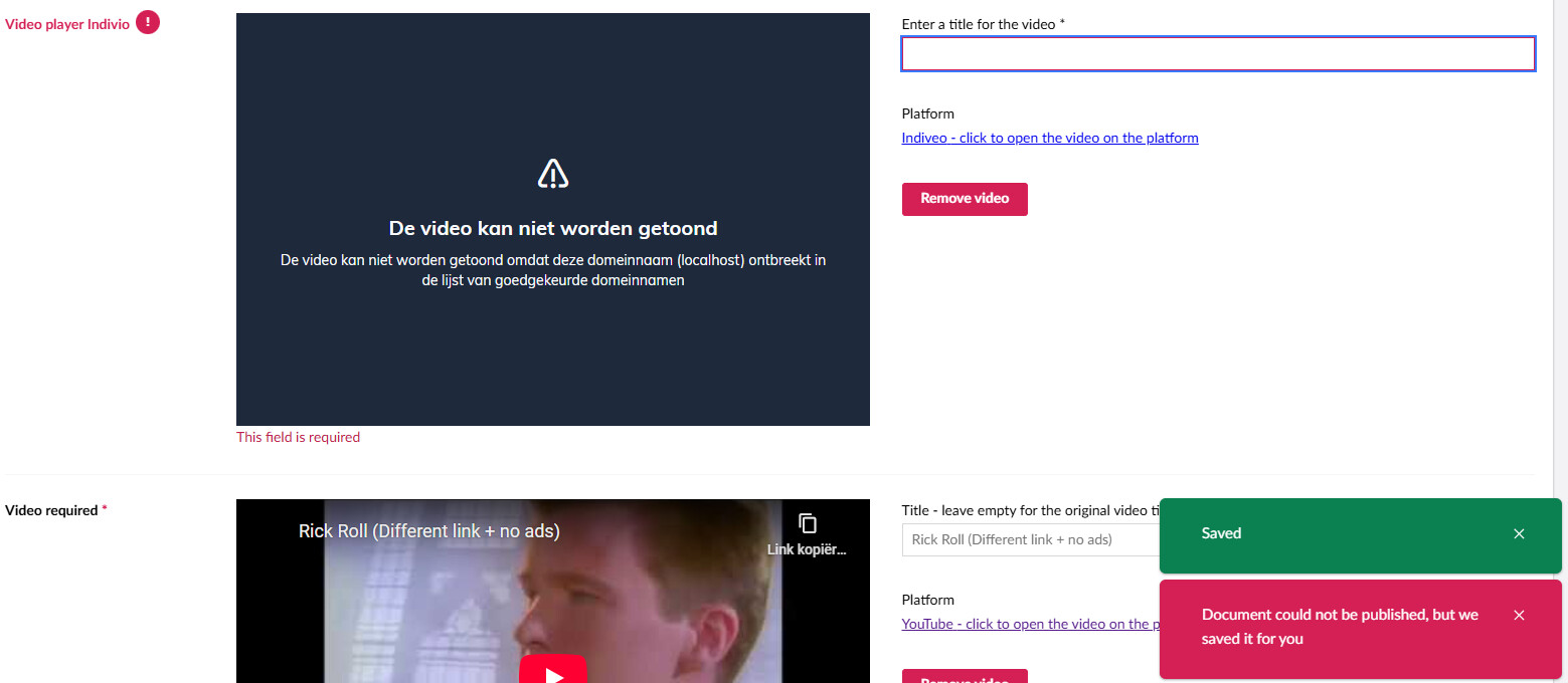
In the bottom corner, that red warning is what you get when you try to publish the page when there are invalid fields. My actual required field simply uses the browser ‘required’ field message on the field itself when validating.
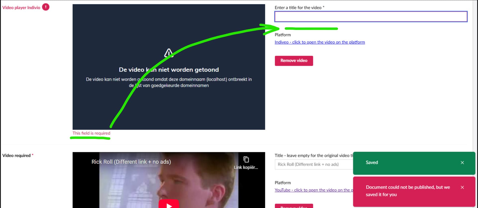
Maybe some crossed wires here :slight_smile:
I thought you might want to move the required message underneath the textbox with the red border that it is required, rather than under the image part.

I actually never saw that the error message was there…seriously… I’ve been focussing on the textbox to show a red border and Umbraco not allowing to publish if it’s required. So I guess I have some work to do, lol! Thanks @warren!