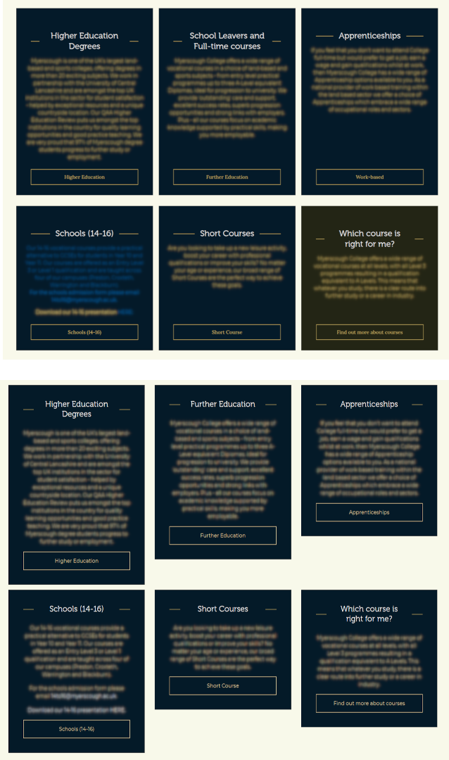
Trying to replicate an old site’s CSS grid with the new blockgrid. It has 6 blocks in 2 rows. Each row’s blocks are the same height, even though the height of the content is different.
In the attached image, the top 6 block are the old site with css grid (and flexbox to stretch the content). The bottom 6 boxes are the new block grid.
My problem is that I can’t work out what I need to do to replicate this in blockgrid. I have a layout block of 3 horizontal blocks, each section of which has another block containing a title, RTE and button vertically. Is it possible, given the way block grid works to get all three layout blocks the same height?
I’d be interested to know if anyone has any hacks for this.
The key to achieving equal columns is how you structure the internal code of the items. You’ll note that most of the styling is happening on the .flex-inner, for example, adding height:100%. I then use the align-content: end; on the .flex-button to ensure that it sits at the bottom.
The result now shows the equal columns with the button correctly aligned to the bottom. You’ll need to add a little more styling to match your design exactly. My example is just the basics for the flexbox itself.
Thanks for the detailed explanation Paul, but this is in a block grid, not plain HTML/CSS which would be easy. The cards are individual blocks sitting in a 4x4x4 layout block which is itself sitting in a 12 column (full width, but with a container width set) layout block.
Are you saying your solution should work in my scenario?
Thanks but once again, this isn’t a normal HTML/CSS scenario which would be easy, as you and Paul have shown.
This is in the Umbraco BlockGrid structure where we don’t have access to the appropriate grid container divs as they’re added automatically.
So the question still is, how do you get constant height grids (blocks) in the Umbraco block grid set up?
I suspect it’s not possible with the current Block Grid system so I’m thinking about raising it as an issue in the issue tracker, so something can be put in place to inject the appropriate classes at the right point.
Here’s the construction as it is now:-
<div class="umb-block-grid__layout-item" data-content-element-type-alias="column4x4x4" data-content-element-type-key="98001417-fd5f-4069-a3f4-a77c706b3033" data-element-udi="umb://element/97ee7bae9d084a41b9600360b822d5c6" data-col-span="12" data-row-span="1" style=" --umb-block-grid--item-column-span: 12; --umb-block-grid--item-row-span: 1; ">

<section class="p-2">
    <div class="mx-auto w-full">

<div class="umb-block-grid__area-container" style="--umb-block-grid--area-grid-columns: 12;">

<div class="umb-block-grid__area" data-area-col-span="4" data-area-row-span="1" data-area-alias="Column1" style="--umb-block-grid--grid-columns: 4;--umb-block-grid--area-column-span: 4; --umb-block-grid--area-row-span: 1;">

<div class="umb-block-grid__layout-container">
        <div class="umb-block-grid__layout-item" data-content-element-type-alias="bl_CourseTypeBlock" data-content-element-type-key="efe51280-3cfd-445b-a9a2-904cc54eefb6" data-element-udi="umb://element/407011b6e1094f6aa2d474e2657e6101" data-col-span="4" data-row-span="1" style=" --umb-block-grid--item-column-span: 4; --umb-block-grid--item-row-span: 1; ">

<div class="bg-caption-background text-center p-12 bl_courseTypeBlock mb-5">
    <div class="course-type-block-header">
        <h2 class="text-white relative z-10 p-0 text-center"><span class=" inline-block bg-caption-background px-4">Higher Education Degrees</span></h2>
    </div>
    <div class="text-dark-gold rte mb-4">
        <p>Lorem ipsum dolor sit amet, consectetur adipiscing elit. Fusce lacinia diam vitae orci accumsan, sit amet imperdiet elit elementum. Nulla mollis turpis at nunc feugiat auctor. Cras ac lorem vitae neque gravida ultrices. Morbi quis sagittis purus. Nam id eleifend arcu, quis tristique lacus. Suspendisse a ante eget purus tristique condimentum. Cras at convallis augue. Maecenas hendrerit id lectus et auctor. Vestibulum sed ultrices ligula. In consectetur, nunc sit amet dignissim condimentum, enim neque efficitur sapien, malesuada efficitur elit dui vel purus. Phasellus ac molestie massa, sed iaculis mi. Vivamus ante elit, posuere vitae arcu ac, scelerisque varius tellus. Sed convallis mattis sapien, nec ultrices enim posuere sit amet.</p>
    </div>
    <div>
        <a href="https://ucmyerscough.ac.uk/" class="text-dark-gold hover:text-black hover:bg-dark-gold hover:underline border-gold border-[1px] block py-4 transition-colors duration-300 ease-in-out" rel="noopener">Higher Education</a>
    </div>
</div>        </div>
</div>

</div>

<div class="umb-block-grid__area" data-area-col-span="4" data-area-row-span="1" data-area-alias="Column2" style="--umb-block-grid--grid-columns: 4;--umb-block-grid--area-column-span: 4; --umb-block-grid--area-row-span: 1;">

<div class="umb-block-grid__layout-container">
        <div class="umb-block-grid__layout-item" data-content-element-type-alias="bl_CourseTypeBlock" data-content-element-type-key="efe51280-3cfd-445b-a9a2-904cc54eefb6" data-element-udi="umb://element/a3923f35249647e9a2aa317fbfb8dbe9" data-col-span="4" data-row-span="1" style=" --umb-block-grid--item-column-span: 4; --umb-block-grid--item-row-span: 1; ">

<div class="bg-caption-background text-center p-12 bl_courseTypeBlock mb-5">
    <div class="course-type-block-header">
        <h2 class="text-white relative z-10 p-0 text-center"><span class=" inline-block bg-caption-background px-4">Further Education</span></h2>
    </div>
    <div class="text-dark-gold rte mb-4">
        <p>Lorem ipsum dolor sit amet, consectetur adipiscing elit. Fusce lacinia diam vitae orci accumsan, sit amet imperdiet elit elementum. Nulla mollis turpis at nunc feugiat auctor. Cras ac lorem vitae neque gravida ultrices. Morbi quis sagittis purus. Nam id eleifend arcu, quis tristique lacus. Suspendisse a ante eget purus tristique condimentum. Cras at convallis augue. Maecenas hendrerit id lectus et auctor. Vestibulum sed ultrices ligula. </p>
    </div>
    <div>
        <a href="/courses/further-education/" class="text-dark-gold hover:text-black hover:bg-dark-gold hover:underline border-gold border-[1px] block py-4 transition-colors duration-300 ease-in-out" rel="noopener">Further Education</a>
    </div>
</div>        </div>
</div>

</div>

<div class="umb-block-grid__area" data-area-col-span="4" data-area-row-span="1" data-area-alias="Column3" style="--umb-block-grid--grid-columns: 4;--umb-block-grid--area-column-span: 4; --umb-block-grid--area-row-span: 1;">

<div class="umb-block-grid__layout-container">
        <div class="umb-block-grid__layout-item" data-content-element-type-alias="bl_CourseTypeBlock" data-content-element-type-key="efe51280-3cfd-445b-a9a2-904cc54eefb6" data-element-udi="umb://element/f0612555597247ca9f6a7c3805af21f2" data-col-span="4" data-row-span="1" style=" --umb-block-grid--item-column-span: 4; --umb-block-grid--item-row-span: 1; ">

<div class="bg-caption-background text-center p-12 bl_courseTypeBlock mb-5">
    <div class="course-type-block-header">
        <h2 class="text-white relative z-10 p-0 text-center"><span class=" inline-block bg-caption-background px-4">Apprenticeships</span></h2>
    </div>
    <div class="text-dark-gold rte mb-4">
        <p>Lorem ipsum dolor sit amet, consectetur adipiscing elit. Fusce lacinia diam vitae orci accumsan, sit amet imperdiet elit elementum. Nulla mollis turpis at nunc feugiat auctor. </p>
    </div>
    <div>
        <a href="/courses/apprenticeships/" class="text-dark-gold hover:text-black hover:bg-dark-gold hover:underline border-gold border-[1px] block py-4 transition-colors duration-300 ease-in-out" rel="noopener">Apprenticeships</a>
    </div>
</div>        </div>
</div>

</div>
</div>

    </div>
</section>        </div>
I’m not sure I understand, everything in a browser is HTML, CSS and JS
Is it because you don’t have access to write your own CSS or is it for the backoffice ?
Let me try to explain another way for those that maybe haven’t used the Block Grid themselves yet. The individual block which you control, is sitting inside a load of predetermined divs with predetermined classes as I’ve just shown in my last post. So all the editor has access to is the content of each block, not the complex containing structures. What I was hoping for was something that I can put into an individual block’s partial that would fix the situation for multiple blocks when added to say a 4x4x4 layout, or something to add to the layout’s partial itself that would fix the same issue, if constant height blocks were required.
Have yet to see what other effects it may have in other areas of the site, though I might be able to add some specificity to it. Looks a lot better, will now add bits in from Paul and Sebastian to make the cards even. But at least I have a grid of black blocks of the same height per row