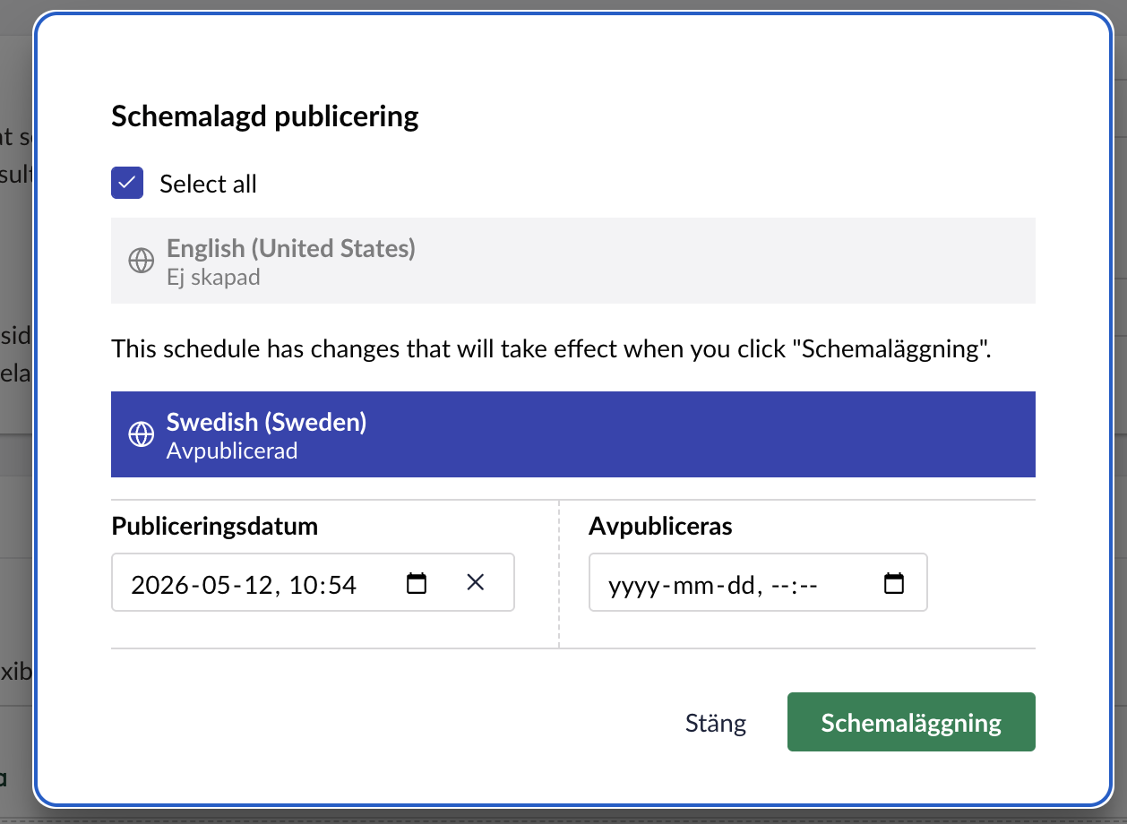
We have a use case where we need to insert a text/disclaimer close to this box, or at least somewhere during the process of setting up a schedule of a publish.
Is this possible somehow with the new backoffice code?
Is it dependant on there being somewhere to “hook into” this section?
Hi @karlmacklin
I can’t see any extension points that allow you to hook into that dialog to add some text unfortunately, so it would require you to replace the modal using something like:
import type { ManifestModal } from '@umbraco-cms/backoffice/modal';

export const manifests: Array<ManifestModal> = [
  {
    type: 'modal',
    alias: 'Umb.Modal.DocumentSchedule', // same alias as the core one
    name: 'Document Schedule with Disclaimer (Example)',
    element: () => import('./document-schedule-with-disclaimer.element.js'),
  },
];
import type { UmbEntryPointOnInit } from '@umbraco-cms/backoffice/extension-api';
import { manifests } from './manifests.js';

export const onInit: UmbEntryPointOnInit = (_host, extensionRegistry) => {
  // Order matters: unregister the core modal first, then register yours
  // under the same alias.
  extensionRegistry.unregister('Umb.Modal.DocumentSchedule');
  extensionRegistry.registerMany(manifests);
};
{
  "name": "Example.SchedulePublishDisclaimer",
  "version": "1.0.0",
  "extensions": [
    {
      "type": "backofficeEntryPoint",
      "alias": "Example.SchedulePublishDisclaimer.EntryPoint",
      "name": "Schedule Publish Disclaimer - Entry Point",
      "js": "/App_Plugins/Example.SchedulePublishDisclaimer/entry-point.js"
    }
  ]
}
Your modal would then be something like:
import { customElement, html, css } from '@umbraco-cms/backoffice/external/lit';
// NOTE: confirm the actual import path by grepping node_modules.
// It's NOT in the public barrel — likely a sub-path like '@umbraco-cms/backoffice/document'.
import { UmbDocumentScheduleModalElement } from '@umbraco-cms/backoffice/document';

@customElement('example-document-schedule-modal')
export class ExampleDocumentScheduleModalElement extends UmbDocumentScheduleModalElement {

  #renderDisclaimer() {
    return html`
      <div class="example-disclaimer">
        <uui-icon name="icon-alert"></uui-icon>
        <div>
          <strong>Before you schedule</strong>
          <p>
            Scheduled publishes go live automatically at the time specified.
            Make sure all content is reviewed and approved — there's no
            second prompt before it appears on the live site.
          </p>
        </div>
      </div>
    `;
  }

  override render() {
    return html`
      ${this.#renderDisclaimer()}
      ${super.render()}
    `;
  }

  static override styles = [
    // Preserve the parent's styles — `super.styles` may be an array or single CSSResult,
    // so flatten defensively. Check the parent file to confirm shape.
    ...(Array.isArray((UmbDocumentScheduleModalElement as any).styles)
      ? (UmbDocumentScheduleModalElement as any).styles
      : [(UmbDocumentScheduleModalElement as any).styles].filter(Boolean)),
    css`
      .example-disclaimer {
        display: flex;
        gap: var(--uui-size-space-3);
        align-items: flex-start;
        padding: var(--uui-size-space-4);
        margin-bottom: var(--uui-size-space-4);
        background: var(--uui-color-warning);
        color: var(--uui-color-warning-contrast);
        border-radius: var(--uui-border-radius);
      }
      .example-disclaimer p {
        margin: var(--uui-size-space-1) 0 0 0;
        font-size: var(--uui-type-small-size);
      }
      .example-disclaimer uui-icon {
        flex-shrink: 0;
        margin-top: 2px;
      }
    `,
  ];
}

export default ExampleDocumentScheduleModalElement;

declare global {
  interface HTMLElementTagNameMap {
    'example-document-schedule-modal': ExampleDocumentScheduleModalElement;
  }
}
This unregisters the built in modal and registers your own which renders the disclaimer before the modal content renders. This was an AI example so may need adapting and checking.
Justin
Interesting, I’ll have to give this a go, thanks!